Friday, April 9, 2010

Flickr Friday - Boiworx and Contrast

Photography at it's most basic level is about asthetics. It's about what is pleasing to the eye, what is displeasing, what tricks the eye into looking longer and making you think.

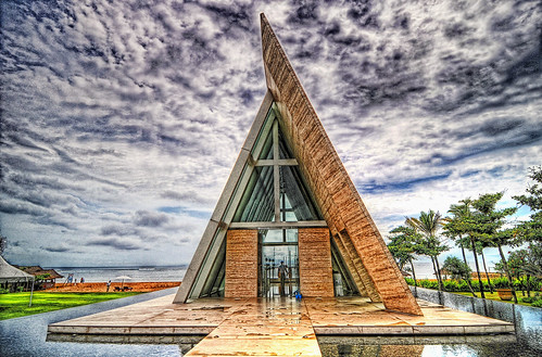
Boiworx on Flickr has got some great examples of using contrast and colour tone to make you look again at images you may have seen before, images of famous landmarks or beaches, and seeing them (forgive me) in a different light.

Some examples work better than others, and this shot is fantastic. The composition is beautiful, with the strong architectural lines, the balmy tone adjustment that makes the grass greener and the supernatural contrast that gives the sky an amazing (and somewhat eerie) depth.

Definitely worth checking out the others in this series!

Thursday, April 8, 2010

Never throw out what you could recycle.

So finally I have finished my post-wedding breather! It was lovely and I don't regret a minute of it, but there are things to be written about. Things, people!

I was reading Lifehacker yesterday, and came randomly across this quote by wildlife photographer Andy Rouse.

"As a photographer, you have to push yourself all the time. I take a lot of crap."

I know that in a one week period, I took about 1000 photos and found that about 10 of them were excellent, about 20 additional shots were good and there were about 50 more that were fixable. That's A LOT of shots that got thrown in my circular filing cabinet.

A lot of them had elements that I could cut and paste into my digital art attempts. When I looked at them the other day, more than a year on, I could see good shots I'd overlooked before and shots that had moved into the fixable pile because my knowledge had increased and I knew what to do to improve it, to make it asthetically worthwhile.

Lifehacker suggests the delete key. I disagree. Never delete your photos. Get yourself an external harddrive and look through your past work occassionally. You never know what you might find.