Thursday, November 19, 2009

The Wednesday Heart - Kelsi Doscher Photography

One of things I love about Etsy is them team environments. It engenders a sense of community and support which is essential for that kind of endeavour. My favourite group is the Sneak Attack Team who surprise a new seller or three each week with a whole bunch of views, hearts, sales and love. Supporting budding shops is one of the best things you can do.

This is all a long way of getting around to today's Wednesday Heart, the new Etsy seller Kelsi Doscher Photography. Her photography is simply stunning.

Take this first image for example. Crisp, clear - a fantastic micro shot.


The colours and the pattern are what mostly drew me to this shot. I love images like this that encourage people to see the beauty in the small, often overlooked, things in the world.

Texture is an important part of the above shot, but it is what takes this next print from being just ordinary to absolutely stunning.


It's the ideal desert shot, it makes you thirsty just looking at it. The cracked, parched imagery just leaves me reaching for my hand cream. And I absolutely love the colours.

Lastly, there is this amazing black and white landscape:


The first thing that jumps out at me from this shot is the excellent composition. I love how the symetery works both vertically and horizontally. It's also a great example of black and white photography. The blacks and whites are sharp and distinct and there is no problem with pixellisation, something I sometimes struggle with.

Kelsi Dolcher Photography is one of those photographers who both inspires me on to greater quality photography and intimidates me a little with how professional her work is. She brings the unrecognised beauties of the natural world out into amazing works of art. Kelsi Dolcher Photography, you are my Wednesday Heart!

Tuesday, November 17, 2009

Great Photographs - Migrant Mother by Dorthea Lange


It was 1936 and the US was in a time of great depression. Dorothea Lange was travelling the countryside with her husband, an economics professor studying the economic conditions. Dorothea, a trained photographer, would take pictures while her husband conducted interviews and provide them free to newspapers to highlight the depth of the problem the country was undergoing. After spotting this impoverished mother with her young children, and without much discussion on either side, Lange took a series of six pictures, the above, Migrant Mother, going on to symbolise the plight of the intransient and poor.

This photo was later identified as being a portrait of Florence Owens Thompson. a 32-year-old widow who earned 50 cents for every 100 pounds of cotton she picked. There is an interesting recorded interview with her that can be found here.

This image really demonstrates the power imbalance between photographer and subject. When asked about the image, which became hugely famous and contributed to Lange being awarded a Guggenheim Fellowship in photography, Florence Thompson is quoted as saying:

"I wish she hadn't taken my picture. I can't get a penny out of it. She didn't ask my name. She said she wouldn't sell the pictures. She said she'd send me a copy. She never did."


Lange's actions brought attention to a serious problem, and even prompted the Federal Goverment to send much needed aide to the area. The photograph took on a life of its own, drawing people in with it's stark reality. So should she be forgiven for taking advantage of Thompson? Is the greater good that she achieved worth the shame that the picture's popularity caused the children in it, who felt stigmatised as lower-class poor?

When Florence Thompson was ill and dying, a campaign was mounted to come to her aid and 2,000 letters arived bringing the family over $35,000 from people who had been uplifted and inspired by the portrait. Florence's son Troy said this:

"None of us ever really understood how deeply Mama’s photo affected people. I guess we had only looked at it from our perspective. For Mama and us, the photo had always been a bit of curse. After all those letters came in, I think it gave us a sense of pride."

You can find the entire series Lange shot of Thompson here. As an interesting contrast, here is a picture of of Thompson and her daughters taken many years after the depression had ended:

Tuesday, November 10, 2009

Canon Photo 5 Competition Finalists

That's right, another year and the Canon Photo 5 competition finalists list is woefully short of a me. However, what it's NOT short on is some absolutely fantastic talent! You can check out all the finalists here, but here are a couple of my choice picks. As this is a positive blog in general, I won't be featuring the ones I looked at and went "What the?? How did THAT beat me?" :-)

As I may have mentioned before, there were five briefs in this year's comp. The first one was close-ups of 100s and 1000s. Here is my favourite, the creepy Sprinkle Face by danielh:


The second brief was to capture an opaque liquid in motion. I never got around to shooting an image for this brief, though I had some cool ideas. This image is It Came From Above by ezzz:


Mostly I just love that the liquid is basically green slime and that it appears to start out of mid-air. Awesome :-)

The next brief was something called a Bokeh experiment. It makes lights appear as little stars. I couldn't make it work with my all-in-one camera though I'm not sure why. This is definitely something I will continue to experiment with in the future. Allyeska, the creator of this image, obviously figured it out better than I did:


Penultimately, there was the fantastic brief of a portrait of someone where somewhere in the image a pair of really cheesy black glasses had to appear. I am just in absolute awe of this Black, White and Read All Over by Bloto:


I mean, the reading theme was used in a lot of the entries, but this shot is just astounding. If it doesn't win it's category I will run rioting in the streets and set fire to some expensive luxury cars, all in the name of art.

And the fifth category was open this year to all and sundry and the theme was nearly black and very low-light photography. I actually had a hard time picking a favourite from this category as small imperfections in each image ruined it a little for me. Overall, the one that stuck with me that most and that I kept wanting to go back and look at again was She's Watching She by WillSpill:


I love the perspective and the atmosphere. I know the slight blurring around the face was unavoidable, and perhaps even intentional, but for me it's a detraction.

So, that's this year! I'll be interested to find out who actually wins, and I'm very much looking forward to competing again next year. I find it one of the best competitions in terms of taxing your creativity.

And don't forget to vote if you want someone to actually win!

Saturday, November 7, 2009

How to get a Treasury Main on Etsy - The Treasury Hunt

It's finally happened! My very first Etsy Treasury Main!

It's crazy, when I first started on Etsy I had no real idea how to get a Treasury. I would show up and there would either be 800 treasuries or there would be 334, I'd keep refreshing to make sure I didn't miss the change and then suddenly there'd be 800 again! It was very, very frustrating. So, for Etsy newcomers and others who just enjoy hearing the sound of my writing voice, here are some tips to getting a Treasury on Etsy:

1) How do I know when??

I don't know how people used to do it, probably by judging the position of the moon at the equinox or something, but Craftopolis has taken all (well, most) of the hard work out of figuring out when your best shot of getting a Treasury is. Just go to www.craftopolis.com and click on "Treasury Clock". It should be just to the right of the "Treasure Hunt" tab. This will tell you approximately when you should be heading over to Etsy to stake out your claim. When the needle hits the red, click on the timer and it will take you straight to the Treasury or Treasury West page!

A word of warning, this site does need some sort of flash player, so if you have an old school system you may not be able to use that aspect of the site.

2) Okay, now what?

So now you're on the Etsy Treasury page. The numbers say 334 or 336 or something like that. Just sit there and watch. This may take some time, so I recommend a crossword puzzle book. You'll need something you can focus on for short periods of time while continuously checking the numbers. There is a countdown timer but they can be inaccurate, especially when there are a lot of people on the site as there usually are when a Treasury is about to open up.

This is very important - Do Not Refresh or Reload! The Treasuries update automatically and you do not need to refresh. In fact, if you do you are far more likely to miss out. I live in Australia, so when I'm Treasury Hunting, I shut down all unessential internet applications to leave the line as free as possible. I don't know if that makes any different, but at least I feel like it does ^_^

3) How will I know when the Treasuries are open?

There will be no warning. The notice that the Treasury is full will just be replaced with this:
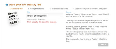

(Image from the Storque - they have a very interesting article on treasuries here)

Then all you need to do is type in your title and press create and congratulations, you have a treasury!

Note at this point that you cannot just create a Treasury and fill a title in later. It is an extremely good idea to have some idea of what your theme will be in advance so that you can very quickly type a title.

4) So - that's it?

Not quite. Then you will be faced with a screen that will ask you to put in all the items that you would like to display in your Treasury. As you will have already had a theme in mind (see above) it's likely that you will know what kind of images you want. If you want to be really organised, Etsy provide this excellent Treasury preparation tool which lets you put in items as practice and see how they look. It's fun to play around with even if you don't have a Treasury Hunt in mind.

I hope this helps some people avoid the frustrations and obstacles I struggled with when I joined Etsy! As I say, I now am the joyful owner of my very own Treasury Main.

Happy Hunting All!

Friday, November 6, 2009

PSPX2 Photo Editing How To and Competition!

Paint Shop Pro X2 has some very simple to use tools that can really enhance your photos and even change the entire feel of them. I think a lot of people try and stick to the simple stuff purely because they don't know what some of the other buttons do. A couple of my favourites are found in the makeover tools. They can be incredibly handy.

Another under-utilised tool can be found under Adjust - Brightness and Contrast - Clarify. Clarify, according to the Corel help section, is "to enhance depth and clarity". Basically what it seems to do is both brighten and sharpen the image simultaneously. Not much is needed and a very low setting (even 1.3 or 1.7) can provide a very satisfying result. The advantage of using this setting seems to be that you don't get the over-pixelisation you can get with the sharpen tool. I would still recommend using the Brightness and Contrast tool after this, just to make sure your image is exactly how you want it.

COMPETITION TIME!

My dear friend has let me take photos of her for my portrait portfolio. Beneath are two images, one as shot and one enhanced. Pick out one of the differences between the two images, throw it in a comment and you're in the draw to win an 8 x 12 inch print of your choice from my store! Looking at the bigger images will definitely give you an advantage in finding things others won't.


Happy hunting and I look forward to picking a winner just before the Sneak Attack on Tuesday, US Time.